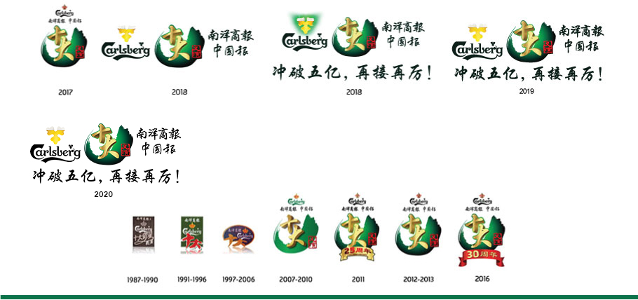
全新《十大义演》标志的概念
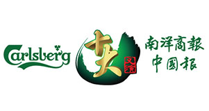
新标志的主要设计涵盖以书法挥洒的一笔划,象征通过以教育为焦点的《十大义演》对华社的支持。作为独特的中华艺术,华文书法是华社的核心元素之一,象征的是传统与文化。
笔划形似向上握起的手,象征所有《十大义演》参与者的团结,这只手握紧与维护已有21年历史的《十大义演》的特质。
右下角的篆刻印章是由古代帝皇的玉玺发展而来,在古代,皇帝用玉玺在获批准的文书上盖章。
现今,篆刻印章依然被许多爱好此文化者广泛地运用,以之代替普通的罗马文签名。标志上的“义演”二字印章,再次象征正式的认可;展现优秀质感的同时,也突出这项慈善活动的核心要素。
简而言之,标志的设计流畅地将赞助商、主办单位及书法盖章涵括于一笔划的范围内,并强调的是在华人文化传承的意义上,华文教育对华社的重要性。
New Top Ten Charity Campaign Official logo
The primary design for the logo comprises a calligraphy stroke which represents the support to the Chinese community via the Top Ten Charity Campaign focusing on education. Chinese calligraphy, a unique Chinese art, is one of the core elements to the Chinese community that represents tradition and culture.
The shape of the stroke represents a cupped hand that unites all participants and holds together the attributes of the brand new 21st year old Top Ten Charity Campaign. The Chinese stamp carving was originally used as an imperial stamp - a stamp used by the emperor to, in effect, put his stamp of approval on documents.
Nowadays, the Chinese stamp is still being widely-used by many who are traditionally inclined to this culture instead of the normal romanised signatures. Again the execution of the two Chinese characters of ‘Charity Road Show' in the stamp format is to project a formal endorsement, a premiumness whilst upholding the core essence of the charity campaign. In summary, the design of the logo has a smooth flow from the sponsors and organizers to the calligraphy execution within the parameters of the stroke leading to the emphasis of the importance of Chinese education to the Chinese community within the heritage of Chinese culture.

